🌐WEB
[HTML/CSS] Footer 하단 고정
Cocoon_
2022. 12. 7. 20:24
반응형

모바일 웹의 경우에는 하단에 footer 대신 navigationBar를 position: fixed; 하기도 하는데,
일반적인 사이트의 경우 위와 같은 형식으로 레이아웃이 구성되어 있습니다.
📋 HTML 구조
  <body>
    <header>header</header>
    <div id="wrap">
      <div id="content-wrap">
        <div>content-wrap</div>
      </div>
    </div>
    <footer>footer</footer>
  </body>
대략적인 HTML 구조는 위와 같습니다.
일반적으로 header와 footer에 height를 60px씩 주고 wrap에 height로 200px정도를 주면
다음과 같은 결과가 나오게 됩니다.
    <style>
      html,
      body {
        height: 100%;
        padding: 0px;
        margin: 0px;
      }

      header {
        height: 60px;
        background-color: #e9eaed;
      }

      #wrap {
        height: 200px;
      }

      footer {
        height: 60px;
        background-color: #e9eaed;
      }
    </style>
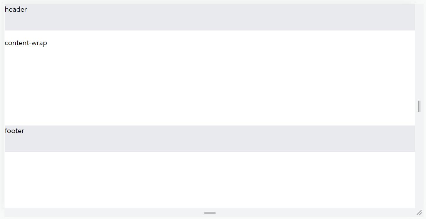
footer영역 아래로 공간이 남게 되어 좋지 않은 레이아웃을 보여주게 됩니다.
이제 CSS 코드를 수정해봅시다.
📋 CSS 코드 수정
<style>
html,
body {
height: 100%;
padding: 0px;
margin: 0px;
}
header {
height: 60px;
background-color: #e9eaed;
}
#wrap {
min-height: calc(100% - 120px);
}
footer {
height: 60px;
background-color: #e9eaed;
}
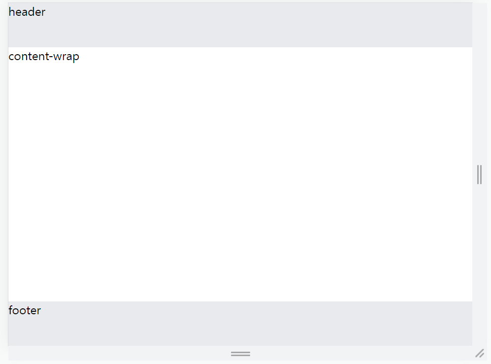
</style>#wrap부분만 바뀌었습니다.
전체 화면 영역에서 header와 footer부분이 각각 60px씩 총 120px을 차지하고 있으므로
#wrap 영역의 min-height를 calc(100% - 120px)로 설정하면 footer을 하단에 고정시킬 수 있습니다.
📋 전체 코드
<!DOCTYPE html>
<html lang="en">
  <head>
    <meta charset="UTF-8" />
    <meta http-equiv="X-UA-Compatible" content="IE=edge" />
    <meta name="viewport" content="width=device-width, initial-scale=1.0" />
    <title>Document</title>
    <style>
      html,
      body {
        height: 100%;
        padding: 0px;
        margin: 0px;
      }

      header {
        height: 60px;
        background-color: #e9eaed;
      }

      #wrap {
        min-height: calc(100% - 120px);
      }

      footer {
        height: 60px;
        background-color: #e9eaed;
      }
    </style>
  </head>
  <body>
    <header>header</header>
    <div id="wrap">
      <div id="content-wrap">
        <div>content-wrap</div>
      </div>
    </div>
    <footer>footer</footer>
  </body>
</html>
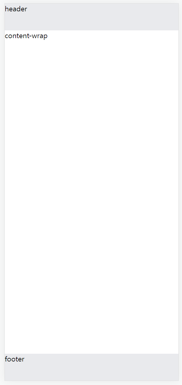
반응형