반응형
먼저 블로그 관리 홈 -> 스킨 편집 -> HTML 편집에 들어갑니다.
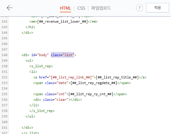
Ctrl+F 를 통해서 class="list" 를 찾아주시고 <li></li> 태그 내용을 아래의 코드로 변경해주세요.
<li style="width:100%; display: table; height: 90px;">
    <span style="float:left">
        <s_list_rep_thumbnail>
            <img style="width:150px; height:100px; min-width:150px; min-height:100px; margin-right:25px;" src="https://img1.daumcdn.net/thumb/R200x0/?scode=mtistory2&fname=">
        </s_list_rep_thumbnail>
    </span>

    <div style="width:100%;display: table-cell; vertical-align: middle; text-align:left;">
        <a style="width:85%;display:inline-block;" href="">
            <span style="display: inline-block;float:none !important; margin-left:5px" class="cnt"></span>
        </a>
        <span class="date" style="display:inline-block;float:right !important;"></span>
        <div class="clear"></div>
    </div>
</li>
img 태그의 style 속성에서 width, height 값을 통해 썸네일의 크기를 변경할 수 있습니다.
수정 전 원본 코드(기록용)
 <li>
   <a href=""></a>
   <span class="date"></span>

   <span class="cnt"></span>
   <div class="clear"></div>
 </li>
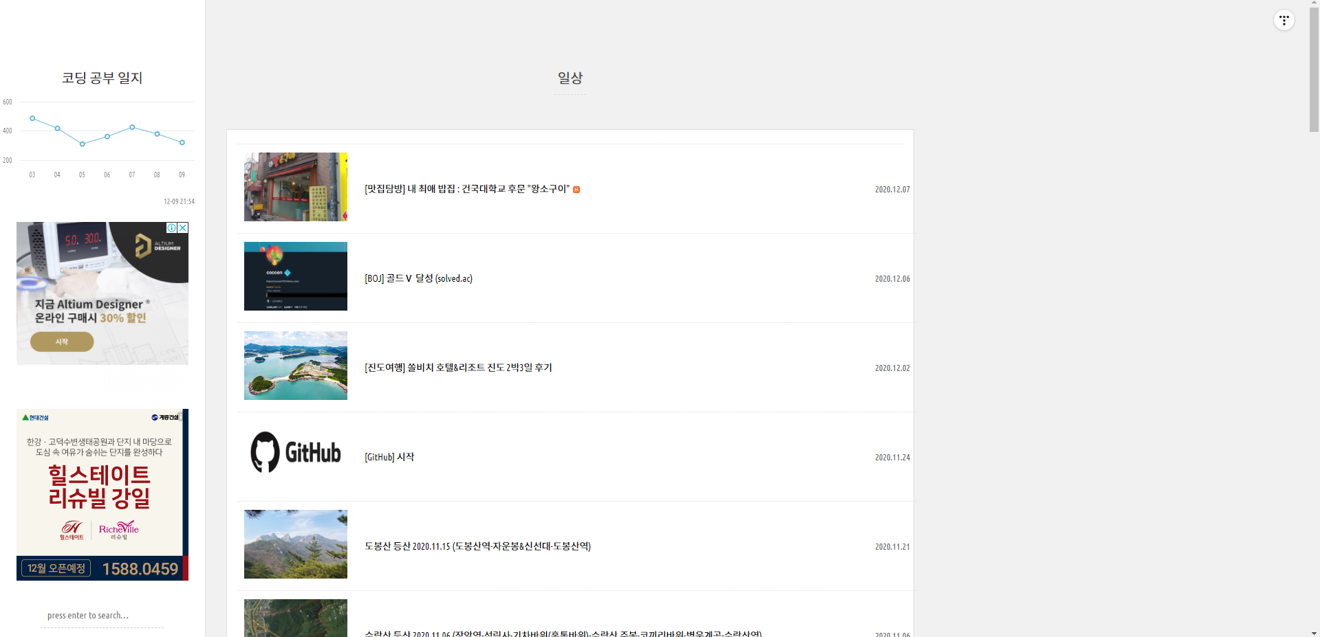
수정 전
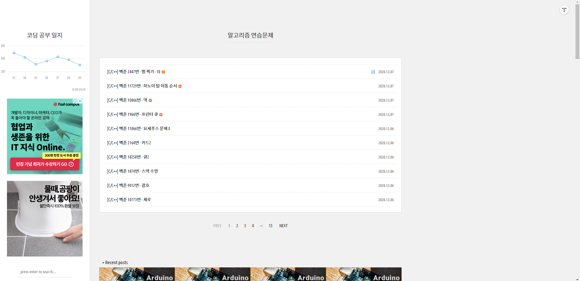
수정 후
변경하고 나니 블로그 보기가 좀 편해진 느낌입니다. 바꾸길잘했네요 ㅎ
반응형
'✒️Tistory' 카테고리의 다른 글
| [Tistory] 티스토리 "붙여넣기 및 이미지 업로드 중입니다" 오류 해결 글 복원 방법 (8) | 2022.01.02 |
|---|---|
| [Tistory] 티스토리 구글서치콘솔 '제외됨', '현재 색인이 생성되지 않음' 해결 (10) | 2021.10.15 |
| [Tistory] 티스토리 글쓰기 단축키 정리 (1) | 2021.10.11 |
| [Tistory] 티스토리 사이드바에 GitHub Contribution Gragh 넣는법 (3) | 2020.12.28 |
| [Tistory] Square 스킨 사이드바 스크롤 본문과 따라가게 설정하는 방법 (0) | 2020.12.08 |