
안녕하세요.
이번 포스팅은 제가 1년간 모달 관련해서 깊게 고민하고 생각했던 부분에 대한 내용입니다.
개인 프로젝트에서는 모달 관련해서 구글링을 하여 나오는 내용으로 쉽게 관리가 가능했지만,
실무를 하다 보니 프로젝트 크기가 커지고, 모달 위에 또 다른 모달이 띄워져야 하는 상황들이 많아 관리 포인트가 많아지는 문제가 발생했었습니다. 관리 포인트가 많아지면 오류가 발생했을 때의 이슈 대응이나 유지보수가 힘들어질 수 도 있겠다고 생각하였고, 이를 해결하기 위해 제가 연구하고 테스트했었던 가장 쉬운 방법부터 제가 현재 사용하고 있는 방법까지 공유를 해드리려 합니다.
react-modal과 같은 npm 라이브러리를 사용해서 모달을 구현할 수도 있지만, 프로젝트 내부의 라이브러리 의존성을 최소화해야겠다는 생각이 들어 간단하게 직접 구현을 하였습니다.
🛠️ 점진적으로 코드를 개선하려 했던 이유
- 페이지마다 모달을 조건부 렌더링으로 관리해야 함
- 하나의 컴포넌트에 모달이 여러 개면, 관리해야 하는 state도 여러 개인 부분
- 컴포넌트 내부가 아닌 외부(일반 자바스크립트 util 파일 등등)에서 모달을 열어야 하는 경우가 생김
📖 Index
- useState로 구현하기
- createPortal 적용
- useModal로 리팩토링
- createRoot 방식
- with redux
- with recoil
- with context
🖥️ 시작하기 전에
포스팅 내 코드 참고 Repository
https://github.com/ma9pie/modal
GitHub - ma9pie/modal
Contribute to ma9pie/modal development by creating an account on GitHub.
github.com
package.json
{
  "name": "modal",
  "version": "0.1.0",
  "private": true,
  "scripts": {
    "dev": "next dev",
    "build": "next build",
    "start": "next start",
    "lint": "next lint"
  },
  "dependencies": {
    "@next/font": "13.4.4",
    "@reduxjs/toolkit": "^1.9.5",
    "@types/node": "20.2.5",
    "@types/react": "18.2.7",
    "@types/react-dom": "18.2.4",
    "axios": "^1.4.0",
    "eslint": "8.41.0",
    "eslint-config-next": "13.4.4",
    "next": "13.4.4",
    "react": "18.2.0",
    "react-dom": "18.2.0",
    "react-redux": "^8.0.5",
    "recoil": "^0.7.7",
    "sass": "^1.62.1",
    "styled-components": "^5.3.11",
    "typescript": "5.0.4"
  },
  "devDependencies": {
    "@types/styled-components": "^5.1.26",
    "babel-plugin-styled-components": "^2.1.3"
  }
}
Confirm 컴포넌트
/* @/components/Confirm.tsx */
import React from "react";
import styled from "styled-components";
type Props = {
title?: string;
message?: string;
close?: () => void;
confirm?: () => void;
};
const Confirm = ({ title, message, close, confirm }: Props) => {
return (
<Wrapper>
<Overlay onClick={close}></Overlay>
<Content>
<Top>
<Title>{title}</Title>
<CloseBtn onClick={close}>✖</CloseBtn>
</Top>
<Message>{message}</Message>
<BtnContainer>
<CancelBtn onClick={close}>cancel</CancelBtn>
<ConfirmBtn
onClick={() => {
confirm && confirm();
close && close();
}}
>
confirm
</ConfirmBtn>
</BtnContainer>
</Content>
</Wrapper>
);
};
export default Confirm;
const Wrapper = styled.div``;
const Overlay = styled.div`
position: fixed;
top: 0;
left: 0;
right: 0;
bottom: 0;
z-index: 999;
background-color: rgba(0, 0, 0, 0.4);
`;
const Content = styled.div`
position: fixed;
display: grid;
gap: 16px;
top: 50%;
left: 50%;
padding: 16px;
min-width: 200px;
max-width: 400px;
border-radius: 12px;
overflow: hidden;
background-color: white;
transform: translate(-50%, -50%);
z-index: 999;
`;
const Top = styled.div`
display: flex;
justify-content: space-between;
`;
const Title = styled.h3``;
const CloseBtn = styled.div`
width: 24px;
height: 24px;
line-height: 24px;
font-size: 20px;
text-align: center;
cursor: pointer;
`;
const Message = styled.p``;
const BtnContainer = styled.div`
display: flex;
gap: 8px;
`;
const CancelBtn = styled.div`
flex: 1;
height: 24px;
text-align: center;
border: 1px solid lightgrey;
border-radius: 4px;
cursor: pointer;
`;
const ConfirmBtn = styled.div`
flex: 1;
height: 24px;
text-align: center;
color: white;
background-color: royalblue;
border-radius: 4px;
cursor: pointer;
`;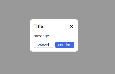
모달은 Alert, Confirm, BottmSheet, Toast, ModalForm, ModalDialog 등등 여러 가지가 있지만, 그중에서도 가장 일반적인 Confirm 형식으로 모달을 디자인해 봤습니다.
props로는 title, message, confirm 함수를 내려줄 수 있고, 필요에 따라 message대신 children을 받아서 컴포넌트를 모달 props로 전달하도록 구성할 수 도 있습니다.
그리고 닫기버튼, cancel버튼, overlay부분을 클릭 시 모달이 닫히도록 props로 받은 close 함수를 onClick이벤트로 등록을 해주었습니다.
1. useState
가장 기본적인 방법입니다. DOM 내부에 Modal을 삽입하고 useState값으로 조건부 렌더링하는 방식입니다.
import React, { useState } from "react";
import Confirm from "@/components/Confirm";
import Button from "@/components/Button";
import styled from "styled-components";
const UseState = () => {
const [isOpen, setIsOpen] = useState<boolean>(false);
const open = () => {
setIsOpen(true);
};
const close = () => {
setIsOpen(false);
};
const confirm = () => {
console.log("confirm clicked");
setIsOpen(false);
};
return (
<Wrapper>
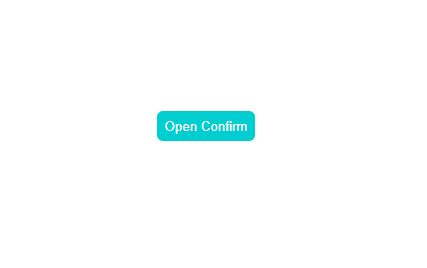
<Button onClick={open}>Open Confirm</Button>
{isOpen && (
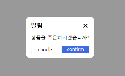
<Confirm
title="알림"
message="상품을 주문하시겠습니까?"
close={close}
confirm={confirm}
></Confirm>
)}
</Wrapper>
);
};
export default UseState;
const Wrapper = styled.div`
width: 100vw;
height: 100vh;
display: flex;
justify-content: center;
align-items: center;
`;버튼을 클릭하면 isOpen의 상태값이 true로 바뀌게 되고 모달이 렌더링 됩니다. confirm을 클릭 시 실행시킬 함수도 정의가 가능합니다.
2. createPortal 적용
1번 방법의 경우 해당 페이지 또는 컴포넌트 내부에서 modal이 렌더링 되므로, modal사용 시 다른 컴포넌트와 겹치거나 z-index를 지정하여 관리를 해야 한다는 문제점이 있습니다. 이러한 문제를 해결하기 위해 createPortal을 사용합니다.
(1) 먼저 next.js를 사용하신다면 _document.tsx, react만 사용하신다면 public 폴더의 index.html에 <div id='modal'></div>을 삽입해 줍니다.
/* @/pages/_document.tsx */

import { Html, Head, Main, NextScript } from "next/document";

export default function Document() {
  return (
    <Html lang="ko">
      <Head />
      <body>
        <div id="modal"></div>
        <Main />
        <NextScript />
      </body>
    </Html>
  );
}
(2) 그리고 Portal 컴포넌트를 생성해 줍니다.
/* @/components/Portal.tsx */

import { ReactNode } from "react";
import { createPortal } from "react-dom";

type Props = {
  children: ReactNode;
};

const Portal = ({ children }: Props) => {
  const node = document.getElementById("modal") as HTMLElement;

  return createPortal(children, node);
};

export default Portal;
ReactDOM에서 제공하는 createPortal은 부모 컴포넌트 DOM 외부에 존재하는 DOM 노드에 해당 컴포넌트를 렌더링 할 수 있게 해주는 함수입니다. 쉽게 말해서 portal을 사용해서 모달 렌더링 시 부모 컴포넌트의 내부가 아닌, 위에서 삽입해 준 <div id='modal'></div>에 모달을 렌더링 시킬 수 있는 것입니다.
(3) 모달에 Portal 컴포넌트를 감싸줍니다.
import React, { useState } from "react";
import Confirm from "@/components/Confirm";
import Button from "@/components/Button";
import Portal from "@/components/Portal";
import styled from "styled-components";

const UseState = () => {
  const [isOpen, setIsOpen] = useState<boolean>(false);
  const open = () => {
    setIsOpen(true);
  };
  const close = () => {
    setIsOpen(false);
  };
  const confirm = () => {
    console.log("confirm clicked");
    setIsOpen(false);
  };
  return (
    <Wrapper>
      <Button onClick={open}>Open Confirm</Button>
      {isOpen && (
        <Portal>
          <Confirm
            title="알림"
            message="상품을 주문하시겠습니까?"
            close={close}
            confirm={confirm}
          ></Confirm>
        </Portal>
      )}
    </Wrapper>
  );
};

export default UseState;

const Wrapper = styled.div`
  width: 100vw;
  height: 100vh;
  display: flex;
  justify-content: center;
  align-items: center;
`;
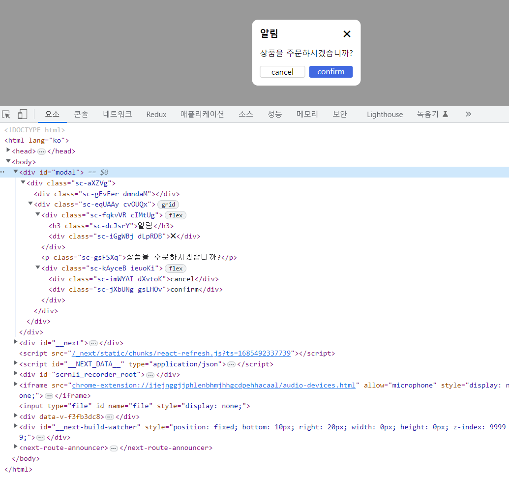
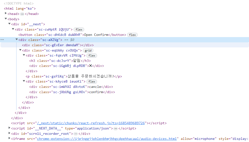
페이지 요소 확인 시 모달이 컴포넌트 내부가 아닌 <div id='modal'></div> 내부에 생성된 것을 확인할 수 있습니다.
저의 경우 예시를 위해서 Portal이라는 컴포넌트를 생성해서 모달에 감싸줬지만, 실사용시에는 Portal 컴포넌트를 생성할 필요 없이 모달 컴포넌트 내부에서 createPortal을 사용하여 적용하시는 게 훨씬 깔끔합니다.
3. useModal로 리팩토링
import React, { useState } from "react";
import Confirm from "@/components/Confirm";
import Button from "@/components/Button";
import Portal from "@/components/Portal";
import styled from "styled-components";

const Page = () => {
  const [isOpen, setIsOpen] = useState<boolean>(false);
  const open = () => {
    setIsOpen(true);
  };
  const close = () => {
    setIsOpen(false);
  };
  const confirm = () => {
    console.log("confirm clicked");
    setIsOpen(false);
  };
  return (
    <Wrapper>
      <Button onClick={open}>Open Confirm</Button>
      {isOpen && (
        <Portal>
          <Confirm
            title="알림"
            message="상품을 주문하시겠습니까?"
            close={close}
            confirm={confirm}
          ></Confirm>
        </Portal>
      )}
    </Wrapper>
  );
};

export default Page;

const Wrapper = styled.div`
  width: 100vw;
  height: 100vh;
  display: flex;
  justify-content: center;
  align-items: center;
`;
useState를 통해 모달을 관리할 시 컴포넌트마다 useState로 모달을 렌더링 할지 말지에 대한 state를 정의하고 open과 close 함수를 생성해줘야 하는 문제점이 있습니다. 해당 부분을 리팩토링 해봅시다.
먼저 모달 state를 아래와 같이 useModal이라는 custom hook으로 만들어 줍니다.
/* @/hooks/useModal.tsx */
import { useState } from "react";

const useModal = () => {
  const [isOpen, setIsOpen] = useState<boolean>(false);
  const open = () => {
    setIsOpen(true);
  };
  const close = () => {
    setIsOpen(false);
  };
  return { isOpen, open, close };
};

export default useModal;
useModal custom hook을 생성했으니 이제 모달 렌더링이 필요한 컴포넌트에서 사용해 봅시다.
import React from "react";
import Confirm from "@/components/Confirm";
import Button from "@/components/Button";
import Portal from "@/components/Portal";
import styled from "styled-components";
import useModal from "@/hooks/useModal";

const Page = () => {
  const { isOpen, open, close } = useModal();

  const confirm = () => {
    console.log("confirm clicked");
    close();
  };
  return (
    <Wrapper>
      <Button onClick={open}>Open Confirm</Button>
      {isOpen && (
        <Portal>
          <Confirm
            title="알림"
            message="상품을 주문하시겠습니까?"
            close={close}
            confirm={confirm}
          ></Confirm>
        </Portal>
      )}
    </Wrapper>
  );
};

export default Page;

const Wrapper = styled.div`
  width: 100vw;
  height: 100vh;
  display: flex;
  justify-content: center;
  align-items: center;
`;
리팩토링 시 위와 같이 state관리를 custom hook에 위임하고 open, close함수를 정의할 필요도 사라지게 됩니다.
코드가 좀 더 깔끔해진 듯합니다.
(1) 페이지에 모달을 삽입하고 모달 관련 state관리 및 open & close 함수를 useModal이라는 custom hook으로 split
(2) createPortal을 사용해서 부모 컴포넌트 DOM 외부에서 모달을 렌더링
여기까지가 제가 생각하기에 가장 일반적인 모달 관리에 대한 내용입니다.
4. createRoot 방식
해당 방식을 설명드리기 전에 먼저 빌드업부터 하겠습니다.
Front에서는 서버와 통신하기 위해서는 아래와 같이 axios라는 라이브러리를 많이 사용합니다.
import React, { useEffect } from "react";
import axios from "axios";

const Page = () => {
  useEffect(() => {
    axios.get("/api/hello").then((res) => {
      // business logic
    }).catch((err) => {
      // error handling
    });
  }, []);
  return <div>index</div>;
};

export default Page;
그리고 해당 api가 오류를 발생시킬 때를 대비하여 catch 함수로 에러 핸들링을 하게 됩니다.
지금 여러분들은 Frontend 개발자이고 회사에서 프로젝트를 하나 담당하고 있다고 가정하겠습니다.
회사 프로젝트에 페이지마다 2~3개씩 api를 호출하고, 프로젝트 전체에서 사용하는 총 api 수는 100개가 넘습니다.
그래서 매일 아침 출근하자마자 해야 할 일은 상용 서비스에서 api응답에 오류가 없는지 확인하기 위해 콘솔창 네트워크 탭을 켜서 500 error 발생하는 api가 있는지 일일이 확인을 합니다.
import React, { useEffect } from "react";
import axios from "axios";

const Page = () => {
  useEffect(() => {
    axios
      .get("/api/user")
      .then((res) => {
        // business logic
      })
      .catch((err) => {
        if (err.response.status === 500) {
          // 서버 오류 알림 관련 모달
        }
      });
  }, []);
  useEffect(() => {
    axios
      .get("/api/login")
      .then((res) => {
        // business logic
      })
      .catch((err) => {
        if (err.response.status === 500) {
          // 서버 오류 알림 관련 모달
        }
      });
  }, []);

  // ... 중략

  useEffect(() => {
    axios
      .get("/api/signup")
      .then((res) => {
        // business logic
      })
      .catch((err) => {
        if (err.response.status === 500) {
          // 서버 오류 알림 관련 모달
        }
      });
  }, []);

  return <div>index</div>;
};

export default Page;
그래서 위와 같이 사용하는 api마다 catch로 500 error를 처리하게 된다면 100개가 넘는 api를 관리하고 유지보수하기 어려울 것입니다. 따라서 api 공통 에러 처리를 위해 axios라는 util을 만들어서 모든 api 통신의 톨게이트로 사용합니다.
/* @/utils/axios.tsx */
import Axios from "axios";

const headers = {
  "Content-Type": "application/json",
};

const axios = Axios.create({
  baseURL: process.env.NEXT_PUBLIC_SERVER_URL,
  timeout: 15000,
  headers: headers,
});

axios.interceptors.request.use(
  (req) => {
    return req;
  },
  (err) => {
    return Promise.reject(err);
  }
);

axios.interceptors.response.use(
  (res) => {
    return Promise.resolve(res);
  },
  (err) => {
    if (err.response.status === 500) {
      // 서버 오류 알림 관련 모달
    }
    return Promise.reject(err);
  }
);

export default axios;
axios를 사용하기 위해서 import axios from "axios" 대신 import axios from "@/utils/axios"를 사용합니다
import axios from "@/utils/axios";
이제 일반 타입스크립트(자바스크립트) utils 파일에서 서버 오류 관련 모달을 렌더링 하여 서버 오류에 대한 공통 처리가 가능하게 됩니다.
axios util file은 컴포넌트가 아니라서 useState도 사용 못하는데...
어떻게 모달을 렌더링 할 수가 있죠?
ReactDOM.createRoot 함수를 사용해서 구현할 수 있습니다.
getElementById를 통해서 모달을 띄울 node를 찾고 ReactDOM.createRoot를 통해서 root를 생성하여 해당 node에 root.render, root.unmount 함수를 통해서 모달을 rendering 하고 unmount 할 수 있습니다.
먼저 서버 오류를 띄울 Alert 모달을 하나 만들어 보겠습니다.
/* @/components/Alert.tsx */

import React from "react";
import styled from "styled-components";

type Props = {
  title?: string;
  message?: string;
  btnText?: string;
  close?: () => void;
};

const Alert = ({ title, message, btnText, close }: Props) => {
  return (
    <Wrapper>
      <Overlay onClick={close}></Overlay>
      <Content>
        <Title>{title}</Title>
        <Message>{message}</Message>
        <ConfirmBtn onClick={close}>{btnText}</ConfirmBtn>
      </Content>
    </Wrapper>
  );
};

export default Alert;

const Wrapper = styled.div``;
const Overlay = styled.div`
  position: fixed;
  top: 0;
  left: 0;
  right: 0;
  bottom: 0;
  z-index: 999;
  background-color: rgba(0, 0, 0, 0.4);
`;
const Content = styled.div`
  position: fixed;
  display: grid;
  gap: 16px;
  top: 50%;
  left: 50%;
  padding: 16px;
  min-width: 200px;
  max-width: 400px;
  border-radius: 12px;
  overflow: hidden;
  background-color: white;
  transform: translate(-50%, -50%);
  z-index: 999;
`;
const Title = styled.h3`
  text-align: center;
`;
const Message = styled.p``;
const ConfirmBtn = styled.div`
  flex: 1;
  height: 24px;
  text-align: center;
  color: white;
  background-color: royalblue;
  border-radius: 4px;
  cursor: pointer;
`;
그리고 modal util을 하나 만들어 줍니다.
/* @/utils/modal.tsx */
import ReactDOM from "react-dom/client";

import Alert from "@/components/Alert";

type Props = {
  isOpen?: boolean;
  title?: string;
  message?: string;
  btnText?: string;
  component?: () => JSX.Element;
};

const modal = {
  open: (Component: (props: Props) => JSX.Element, props: Props) => {
    const defaultProps = {
      isOpen: true,
      close: () => {},
    };
    const container = document.getElementById("modal");
    if (!container) return;
    const root = ReactDOM.createRoot(container);

    defaultProps.close = () => {
      defaultProps.isOpen = false;
      root.unmount();
    };

    defaultProps.isOpen = true;
    root.render(<Component {...defaultProps} {...props}></Component>);
  },

  // alert
  openAlert: (props: Props) => {
    modal.open(Alert, props);
  },
};

export default modal;
그리고 axios uitl에서 아래와 같이 modal을 open 시킬 수 있습니다.
/* @/utils/axios.tsx */
import Axios from "axios";
import modal from "@/utils/modal";
const headers = {
"Content-Type": "application/json",
};
const axios = Axios.create({
baseURL: process.env.NEXT_PUBLIC_SERVER_URL,
timeout: 15000,
headers: headers,
});
axios.interceptors.request.use(
(req) => {
return req;
},
(err) => {
return Promise.reject(err);
}
);
axios.interceptors.response.use(
(res) => {
return Promise.resolve(res);
},
(err) => {
if (err.response.status === 500) {
// 서버 오류 알림 관련 모달
modal.openAlert({
title: "알림",
message: "서버 오류가 발생하였습니다.",
btnText: "확인",
});
}
return Promise.reject(err);
}
);
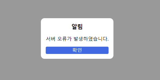
export default axios;api에서 일부러 500 error를 발생시키면 아래와 같은 모달이 뜨는 것을 확인할 수 있습니다.
컴포넌트 내부에서도 모달을 띄울 수 있습니다.
import React, { useEffect } from "react";
import modal from "@/utils/modal";

const Page = () => {
  useEffect(() => {
    modal.openAlert({
      title: "Notice",
      message: "Message",
      btnText: "Ok",
    });
  }, []);

  return <div>index</div>;
};

export default Page;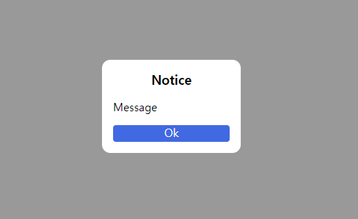
그러나 createRoot 방식 같은 경우에는 next/router의 useRouter나 recoilState 같은 일부 기능사용 시 에러가 발생하는 문제점이 있습니다.(React DOM의 계층구조에서 렌더링 된 것이 아닌 node에 컴포넌트를 create 하는 방식이기 때문인 것으로 생각됩니다.)
그렇기 때문에 createRoot 방식의 경우는 util파일에서 데이터 변경이 없는 정적이고 간단한 알림 모달이 필요할 경우에만 사용하는 것을 추천드립니다.
5. with Redux
useState로 모달을 사용하면서 모달 관련 상태관리 코드가 많아지게 되었고 "모달을 전역상태로 관리를 하면 어떨까?"라는 아이디어가 떠올라서 그 당시 프로젝트에서 사용 중인 전역상태관리 라이브러리인 redux로 모달을 구현하여 썼었던 경험이 있습니다.
컴포넌트를 props로 받는 모달 컴포넌트 생성
/* @/components/Modal.tsx */

import React from "react";
import styled from "styled-components";

type Props = {
  close?: () => void;
  component?: () => JSX.Element;
};

const Alert = ({ component, close }: Props) => {
  return (
    <Wrapper>
      <Overlay onClick={close}></Overlay>
      <Content> {component && component()}</Content>
    </Wrapper>
  );
};

export default Alert;

const Wrapper = styled.div``;
const Overlay = styled.div`
  position: fixed;
  top: 0;
  left: 0;
  right: 0;
  bottom: 0;
  z-index: 999;
  background-color: rgba(0, 0, 0, 0.4);
`;
const Content = styled.div`
  position: fixed;
  display: grid;
  gap: 16px;
  top: 50%;
  left: 50%;
  padding: 16px;
  min-width: 200px;
  max-width: 400px;
  border-radius: 12px;
  overflow: hidden;
  background-color: white;
  transform: translate(-50%, -50%);
  z-index: 999;
`;
(1) 프로젝트 redux 폴더 내 store, reducer, hooks 구현
/* @/redux/store.ts */

import { configureStore } from "@reduxjs/toolkit";
import modalReducer from "@/redux/modal";

export const store = configureStore({
  reducer: { modal: modalReducer },
  middleware: (getDefaultMiddleware) =>
    getDefaultMiddleware({ serializableCheck: false }),
});

// @ts-ignore
export type RootState = ReturnType<typeof store.getState>;
export type AppDispatch = typeof store.dispatch;
Store 설정입니다. 가장 간단하게 설정하였고 state로 컴포넌트를 저장하기 때문에 미들웨어 serializableCheck를 false로 설정해 줍시다.(컴포넌트 children의 순환구조 때문에 직렬화 이슈가 있어 콘솔 에러가 발생하는 것으로 기억)
/* @/redux/hooks.ts */

import { TypedUseSelectorHook, useDispatch, useSelector } from "react-redux";
import type { RootState, AppDispatch } from "@/redux/store";

export const useAppDispatch = () => useDispatch<AppDispatch>();
export const useAppSelector: TypedUseSelectorHook<RootState> = useSelector;
타입스크립트에서 useSelector, useDispatch를 좀 더 쉽게 사용하기 위해 만들어 줍니다.
/* @/redux/modal.ts */

import { createSlice } from "@reduxjs/toolkit";
import type { RootState } from "@/redux/store";

export type ModalProps = {
  key?: string;
  component?: () => JSX.Element;
};

const initialState: ModalProps[] = [];

const modalReducer = createSlice({
  name: "modal",
  initialState,
  reducers: {
    setState(state, action) {
      return action.payload;
    },
  },
});

export const modalActions = { ...modalReducer.actions };
export const selecModal = (state: RootState) => state.modal;
export default modalReducer.reducer;
reducer부분입니다. 상태 관리를 위한 setState함수만 추가해 줍니다.
(2) _app.tsx에 redux Provider를 감싸주고, 모달을 띄워줄 root 컴포넌트를 생성하여 _app.tsx에 넣어줍니다.
/* @/components/ReduxModalRoot.tsx */

import React from "react";
import { useAppSelector } from "@/redux/hooks";
import Modal from "@/components/Modal";

const ReduxModalRoot = () => {
  const modals = useAppSelector((state) => state.modal);

  return (
    <div id="redux-modal">
      {modals.map((modal) => (
        <Modal key={modal.key} {...modal}></Modal>
      ))}
    </div>
  );
};

export default ReduxModalRoot;
모달을 띄워줄 root입니다. 배열을 map으로 돌려서 modal들을 띄워주는 역할을 합니다.
/* @/pages/_app.tsx */

import "@/styles/globals.scss";
import type { AppProps } from "next/app";
import { store } from "@/redux/store";
import { Provider } from "react-redux";
import ReduxModalRoot from "@/components/ReduxModalRoot";

export default function App({ Component, pageProps }: AppProps) {
  return (
    <Provider store={store}>
      <ReduxModalRoot></ReduxModalRoot>
      <Component {...pageProps} />
    </Provider>
  );
}
(3) 모달 사용을 위한 custom hooks를 만들어 줍니다.
/* @/hooks/useReduxModal.tsx */

import { modalActions, ModalProps } from "@/redux/modal";
import { useAppSelector, useAppDispatch } from "@/redux/hooks";

const useReduxModal = () => {
  const dispatch = useAppDispatch();
  const modals = useAppSelector((state) => state.modal);

  const openModal = (props: ModalProps) => {
    const key = Math.random().toString(36).substring(2);
    const nextProps = {
      key,
      close: () => dispatch(modalActions.setState([...modals])),
      ...props,
    };
    dispatch(modalActions.setState([...modals].concat(nextProps)));
  };

  return { openModal };
};

export default useReduxModal;
openModal 함수에서는 unique 한 key와 close 함수를 만들어 modals state 배열에 모달을 추가해 주는 역할을 합니다.
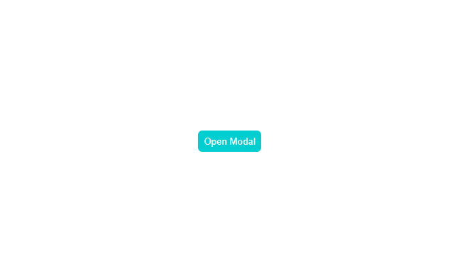
사용 예시
import React from "react";
import useReduxModal from "@/hooks/useReduxModal";
import styled from "styled-components";
import Button from "@/components/Button";

const Page = () => {
  const modal = useReduxModal();

  const open = () => {
    modal.openModal({ component: () => <Content>modal content</Content> });
  };

  return (
    <Wrapper>
      <Button onClick={open}>Open Modal</Button>
    </Wrapper>
  );
};

export default Page;

const Wrapper = styled.div`
  width: 100vw;
  height: 100vh;
  display: flex;
  justify-content: center;
  align-items: center;
`;
const Content = styled.div`
  width: 200px;
  height: 300px;
`;
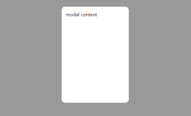
useReduxModal hooks를 사용하여 modal.openModal로 모달을 띄워줄 수 있습니다. 전역 상태로 모달을 관리할 경우 장점은 모달의 props로 전달하는 component 내부에서도 next/router나 redux state값들을 사용할 수 있다는 점, 모달에 type이라는 property를 추가하여 openAlert, openConfirm, openBottomSheet 같은 함수들을 생성하고 root에서 type별로(Alert, Confirm, BottomSheet,...) 필터링하여 렌더링 할 수 있다는 장점이 있습니다.
5. with Recoil
recoil을 사용하는 방법은 redux를 사용하여 구현한 방법과 흡사하며, redux보다 boilerplate 코드가 적다는 장점이 있습니다.
(1) 상태 atoms 생성
/* @/recoil/atoms.ts */

import { atom } from "recoil";

export type ModalProps = {
  key?: string;
  component?: () => JSX.Element;
};

export const modalState = atom<ModalProps[]>({
  key: "modalState",
  default: [],
});
(2) ModalRoot 생성 및 _app.tsx 설정
/* @/components/RecoilModalRoot.tsx */

import React from "react";
import Modal from "@/components/Modal";
import { useRecoilValue } from "recoil";
import { modalState } from "@/recoil/atoms";

const RecoilModalRoot = () => {
  const modals = useRecoilValue(modalState);
  return (
    <div id="recoil-modal">
      {modals.map((modal) => (
        <Modal key={modal.key} {...modal}></Modal>
      ))}
    </div>
  );
};

export default RecoilModalRoot;
/* @/pages/_app.tsx */
import "@/styles/globals.scss";
import type { AppProps } from "next/app";
import { RecoilRoot } from "recoil";
import RecoilModalRoot from "@/components/RecoilModalRoot";
export default function App({ Component, pageProps }: AppProps) {
return (
<RecoilRoot>
<RecoilModalRoot></RecoilModalRoot>
<Component {...pageProps} />
</RecoilRoot>
);
}_app.tsx에서는 전체를 RecoilRoot로 감싸주고 ModalRoot를 삽입해 줍니다.
(3) useRecoilModal custom hooks 생성
/* @/hooks/useRecoilModal.tsx */

import { useRecoilState } from "recoil";
import { modalState, ModalProps } from "@/recoil/atoms";

const useRecoilModal = () => {
  const [modals, setModals] = useRecoilState(modalState);

  const openModal = (props: ModalProps) => {
    const key = Math.random().toString(36).substring(2);
    const nextProps = {
      key,
      close: () => setModals([...modals]),
      ...props,
    };
    setModals([...modals].concat(nextProps));
  };

  return { openModal };
};

export default useRecoilModal;
redux를 이용한 방식에서와 같이 openModal이라는 함수를 통해 모달 상태 관리를 해줍니다.
사용 예제
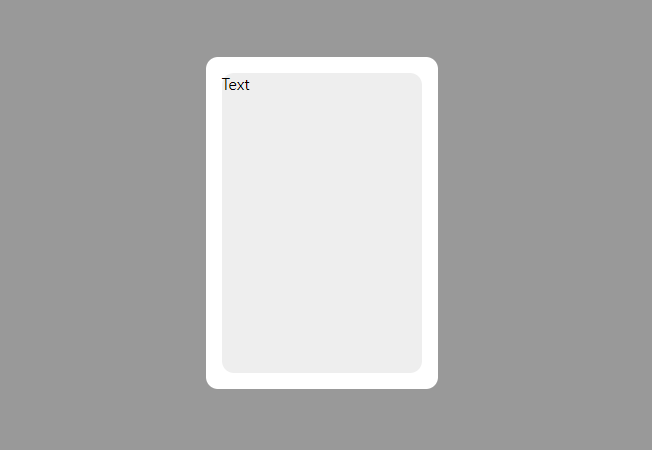
import React from "react";
import useRecoilModal from "@/hooks/useRecoilModal";
import styled from "styled-components";
import Button from "@/components/Button";
const Page = () => {
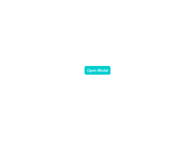
const modal = useRecoilModal();
const open = () => {
modal.openModal({ component: () => <Content>component</Content> });
};
return (
<Wrapper>
<Button onClick={open}>Open Modal</Button>
</Wrapper>
);
};
export default Page;
const Wrapper = styled.div`
width: 100vw;
height: 100vh;
display: flex;
justify-content: center;
align-items: center;
`;
const Content = styled.div`
width: 200px;
height: 300px;
background-color: #eeeeee;
border-radius: 12px;
`;
useReduxModal hooks와 마찬가지로 openModal을 통해서 모달에 렌더링 할 컴포넌트를 props로 전달하여 모달을 렌더링 시킬 수 도 있고, openAlert, openConfirm 함수 생성 후 title, message, onClickConfirm을 props로 전달하여 Alert나 Confirm을 띄울 수 도 있습니다. 아무래도 redux보다는 recoil이 보일러플레이트 코드가 적고 사용이 쉬워서 사용하기에 간편하다는 생각이 듭니다.
6. with Context
redux, recoil을 통해서 모달 관리를 할 시 redux나 recoil을 무조건 사용해야 한다는 의존성이 생기게 됩니다. 그러한 의존성을 제거하기 위해서 React 내장 API인 useContext를 통해서 구현을 해봤습니다.
(1) useContextModal를 만들어주고 ModalProvider 생성 후 _app.tsx에 설정
/* @/hooks/useContextModal.tsx */

import { useContext } from "react";
import { ModalContext } from "@/components/ModalProvider";
import { ModalProps, Modals } from "@/types";

let tmpModals: Modals;

const useContextModal = () => {
  const { modals, setModals } = useContext(ModalContext);
  tmpModals = modals;

  const openModal = (props: ModalProps) => {
    const hashMapA: Map<string, ModalProps> = new Map(tmpModals);
    const key = Math.random().toString(36).substring(2);
    props.key = props.key || key;
    props.close = async () => {
      const hashMapB = new Map(hashMapA);
      if (props.key) {
        hashMapB.delete(props.key!);
        setModals(new Map(hashMapB));
      }
    };
    hashMapA.set(props.key, props);
    setModals(hashMapA);
  };

  const closeModal = (key?: string) => {
    const hashMap: Map<string, ModalProps> = new Map(tmpModals);
    if (key) {
      const props = hashMap.get(key);
      if (props) {
        hashMap.delete(key);
        setModals(new Map(hashMap));
      }
      return;
    }
  };

  const openAlert = (props: ModalProps) => {
    openModal({ ...props, type: "ALERT" });
  };

  const openConfirm = (props: ModalProps) => {
    openModal({ ...props, type: "CONFIRM" });
  };

  return {
    openModal,
    closeModal,
    openAlert,
    openConfirm,
  };
};

export default useContextModal;
/* @/components/ModalProvider.tsx */
import React, { createContext, ReactNode, useState } from "react";
import Alert from "@/components/Alert";
import Confirm from "@/components/Confirm";
import Modal from "@/components/Modal";
import { ModalProps, Modals } from "@/hooks/useContextModal";
type Props = {
children: ReactNode;
};
export const ModalContext = createContext({
modals: new Map(),
setModals: (state: Modals) => {},
});
const ModalProvider = ({ children }: Props) => {
const [modals, setModals] = useState<Modals>(new Map());
const alertList: ModalProps[] = [];
const confirmList: ModalProps[] = [];
const modalList: ModalProps[] = [];
modals.forEach((value, key) => {
switch (value.type) {
case "ALERT":
alertList.push(value);
break;
case "CONFIRM":
confirmList.push(value);
break;
default:
modalList.push(value);
break;
}
});
return (
<ModalContext.Provider value={{ modals, setModals }}>
<div id="alert">
{alertList.map((modal) => (
<Alert key={modal.key} {...modal}></Alert>
))}
</div>
<div id="confirm">
{confirmList.map((modal) => (
<Confirm key={modal.key} {...modal}></Confirm>
))}
</div>
<div id="modal">
{modalList.map((modal) => (
<Modal key={modal.key} {...modal}></Modal>
))}
</div>
{children}
</ModalContext.Provider>
);
};
export default ModalProvider;redux와 recoil에서 구현했던 방식과는 조금 다르게 Hash Map을 사용하여 state를 관리합니다. 그리고 Map 순회를 통해 각 타입별(Alert, Confirm, Modal)로 배열에 담아 DOM에 모달을 렌더링을 합니다. 그리고 해당 컴포넌트를 ModalContext.Provider로 감싸주어 state를 공급합니다.
/* @/pages/_app.tsx */

import "@/styles/globals.scss";
import type { AppProps } from "next/app";
import ModalProvider from "@/components/ModalProvider";

export default function App({ Component, pageProps }: AppProps) {
  return (
    <ModalProvider>
      <Component {...pageProps} />
    </ModalProvider>
  );
}
사용 예제
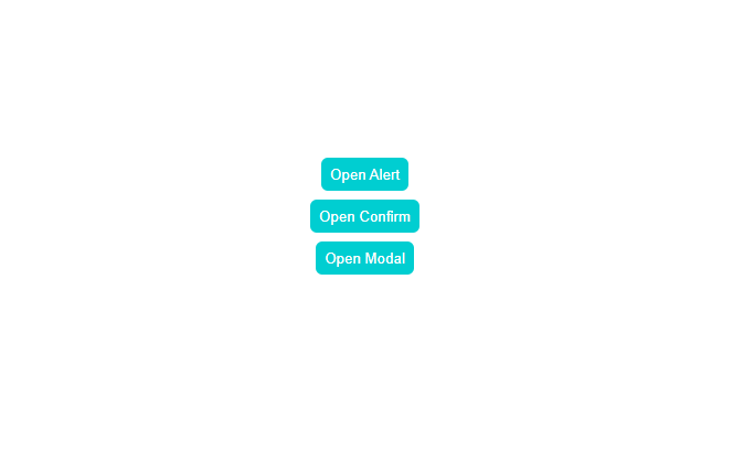
import React from "react";
import useContextModal from "@/hooks/useContextModal";
import styled from "styled-components";
import Button from "@/components/Button";
const Page = () => {
const modal = useContextModal();
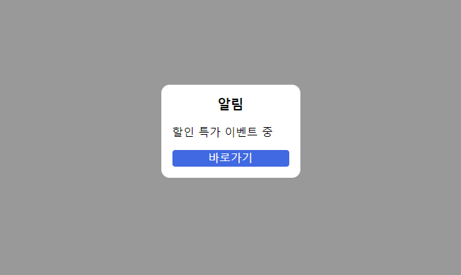
const openAlert = () => {
modal.openAlert({
title: "알림",
message: "할인 특가 이벤트 중",
btnText: "바로가기",
});
};
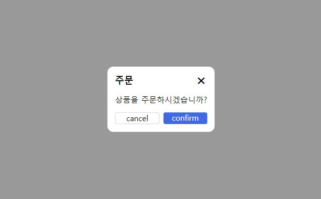
const openConfirm = () => {
modal.openConfirm({
title: "주문",
message: "상품을 주문하시겠습니까?",
confirm: () => {
console.log("주문 완료");
},
});
};
const openModal = () => {
modal.openModal({ component: () => <Content>Modal component</Content> });
};
return (
<Wrapper>
<Button onClick={openAlert}>Open Alert</Button>
<Button onClick={openConfirm}>Open Confirm</Button>
<Button onClick={openModal}>Open Modal</Button>
</Wrapper>
);
};
export default Page;
const Wrapper = styled.div`
width: 100vw;
height: 100vh;
display: flex;
flex-direction: column;
justify-content: center;
align-items: center;
gap: 8px;
`;
const Content = styled.div`
width: 400px;
height: 200px;
`;

이 방식의 경우 제가 현재 사용하고 있는 방식이며 라이브러리 의존성 없이 내장 함수만을 사용하여 구현할 수 있는 방법입니다. 본 포스팅에서는 아이디어를 공유한다는 느낌으로 최대한 간단하게 구현을 하였고 실제로 사용을 하신다면 해당 아이디어를 통해서 커스터마이징하고 프로젝트의 특성에 맞게 변환시켜줘야 합니다.
예를 들어 modal의 width, height, padding, top, left, cancelBtnText, confirmBtnText, onAfterOpen, onAfterClose 등등을 props로 받아서 처리를 할 수 도 있고, isOpen이라는 변수를 props로 넘겨줘서 모달이 만들어지고 사라지는 애니메이션을 보여주고 200ms 뒤 모달을 state에서 제거하는 방식으로도 구현이 가능합니다.
그리고 컴포넌트가 아닌 파일에서 모달이 띄울 필요가 생길 때는 해당 방식을 사용할 수 없어 (4) createRoot 방식을 혼용해서 사용하고 있습니다. 좀 더 좋은 아이디어를 아시는 분은 댓글로 알려주시면 감사드리겠습니다.
아래의 링크는 제가 시간 날 때마다 만들고 있는 todo list app에서 사용할 모달들을 테스트하는 페이지입니다. context를 통해서 모달을 관리하는 프로젝트이며 실제 사용 코드는 해당 레포에서 확인이 가능합니다.
https://todo-list-ma9pie.vercel.app/test/modals
Todo List App
사용자가 할 일을 리스트에 추가하고, 체크박스로 완료 여부를 표시할 수 있도록 해주는 Todo List App입니다. 사용자들은 할 일을 보다 체계적으로 관리할 수 있으며, 직관적이고 간단한 디자인으
todo-list-ma9pie.vercel.app
https://github.com/ma9pie/todo-list
GitHub - ma9pie/todo-list
Contribute to ma9pie/todo-list development by creating an account on GitHub.
github.com
글을 읽으시고 의문점이나 잘못된 점 있을 시 편하게 질문 주시면 감사드려요!
'⚛️React' 카테고리의 다른 글
| [React] Warning: validateDOMNesting(...): <p> cannot appear as a descendant of <p>. 오류 해결 (2) | 2022.06.22 |
|---|---|
| [React] 리액트 다음 주소 검색 (react-daum-postcode) (0) | 2022.05.26 |
| [React] 리액트 .js vs .jsx 차이점 (0) | 2022.03.18 |
| [React] 리액트 자식 컴포넌트에서 부모 컴포넌트로 데이터 전달하기 (2) | 2022.03.12 |
| [React] 리액트 setState Callback 함수 사용법 (0) | 2022.03.11 |